🎮 Wishlist Chessarama on Steam: As we inch closer to launch, your support means everything. Every person who adds the game to their wishlist makes a difference and helps us reach more people who might fall in love with Chessarama just as much as we have. With your support, Chessarama is becoming a reality. We're excited to share this adventure with you. Stay tuned for more exciting news!
P.S. – Haven’t entered our giveaway yet? We've extended our giveaway deadline to December 16th. Win a Chessarama-themed chess board signed by chess masters.
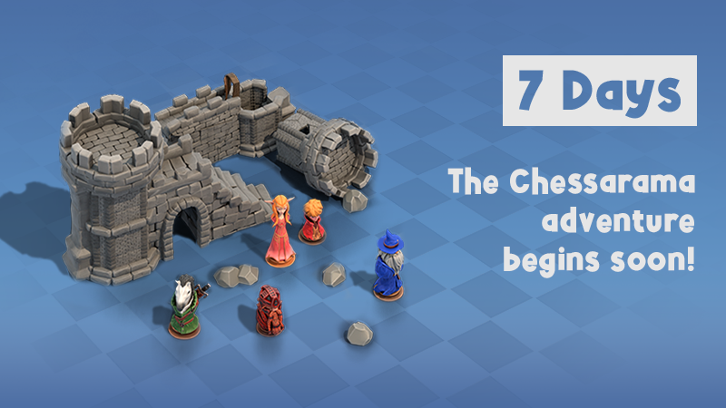
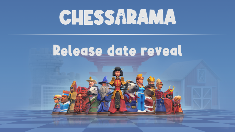
⏳ 7 Days Left: the Chessarama adventure begins soon!
The countdown has officially begun! We're only 7 days away from unveiling Chessarama to the world. Born from our indie spirit in vibrant Brazil, this game is our love letter to chess lovers and puzzle enthusiasts alike.
🏆 Join our Exciting Giveaway
As we gear up for the big day, don't miss out on our fantastic giveaway on Gleam.io. Win a Chessarama-themed chess board signed by chess legends! It's our way of celebrating this journey with our beloved community.
International Campaign - worldwide, excluding Brazil (chance to win 1 out of 8 chess boards).
Brazil-Only Campaign - since we’re a Brazilian studio, we’re offering an exclusive campaign for those who live in Brazil (chance to win 1 out of 8 chess boards).
🎮 Wishlist Chessarama on Steam
Be among the first to explore our unique blend of chess-inspired puzzles and breathtaking dioramas. Every wishlist brings us closer to sharing our dreams with the world.
A sneak peek into the mesmerizing world of Chessarama – Where every move tells a story.
We're nearly there, and your support has been the wind beneath our wings. Stay tuned for more updates as the launch day approaches. Let's make Chessarama a game to remember!
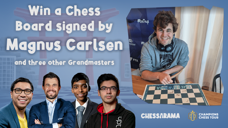
Giveaway - Chessboard signed by Magnus Carlsen and three other Grandmasters
Have you ever wanted an exclusive chessboard signed by the chess champion Magnus Carlsen? So check it out:
We’re giving away 8 Chessarama chess boards for each campaign signed by four amazing Grandmasters: Magnus Carlsen, Praggnanandhaa, Wesley So, and Anish Giri.
We have 2 Gleam campaigns for this giveaway:
International Campaign - worldwide, excluding Brazil (chance to win 1 out of 8 chess boards).
Brazil-Only Campaign - since we’re a Brazilian studio, we’re offering an exclusive campaign for those who live in Brazil (chance to win 1 out of 8 chess boards).
How to participate?
Login to our Gleam Campaign with a name and e-mail.
Complete at least one action in the Gleam Campaign to validate your entry.
The more actions you take, the more chances of winning!
Until what day can I participate?
From November 21st at 6 am PST to December 6th at 12 am PST* *The winners will be announced on our social media within two weeks after this date.
Good luck, and don’t forget to check the rules on the event page. Don’t miss your chance to have a chessboard signed by four of the most talented chess players in the world! 💪
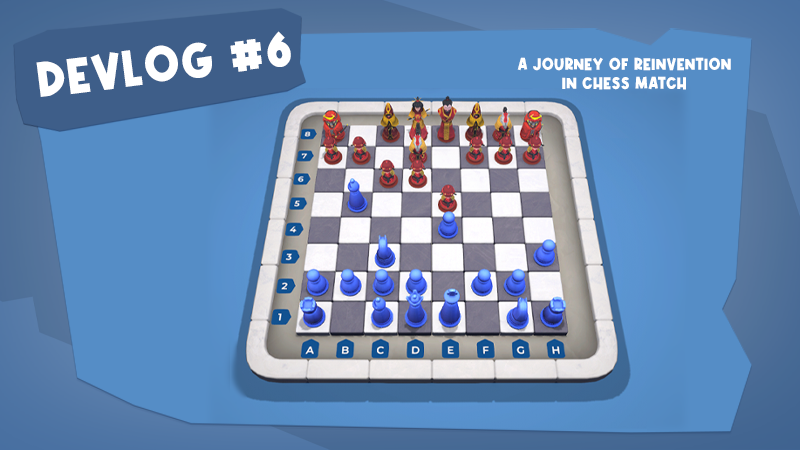
Beyond the board: a journey of reinvention in Chess Match
Welcome back to Checkmate Chronicles, the devlog series where we unveil the behind-the-scenes of Chessarama's development process! Today, we’ll dive into the creative process behind the redesign of the board in our Chess Match game mode.
Starting point: a simple and functional board
Every great journey begins with a single step, and ours started with a simple and functional board created on a provisional basis.
However, it didn’t capture the essence of Chessarama. It was necessary to elevate its standard and grant it the deserved brilliance.
Old version of the board. We had created a simple and functional version, but it was necessary to elevate its standard to reach the level of quality we aspire to in Chessarama.
Transformation step by step
We kicked off the transformation by creating seven different variations for the new board. Each of them explored distinct possibilities, varying in the colors of the board, the tiles, the materials, as well as details in the finish, unleashing the first wave of changes.
After this exploration, we decided to iterate on more subtle and less realistic textures, seeking a more stylized approach.
Initial concepts for the board’s redesign exploring variations of colors, textures, and modeling.
One of the most valuable insights from this initial exploration was the decision to position the coordinates directly on the board, providing a more integrated interface and avoiding reading issues due to contrast changes.
We still had doubts about the blue colors on the tiles, an issue we knew would only be resolved with direct testing in the game engine.
Variations of concepts exploring the board in white and blue, but that presented a reading problem with low contrast from the tile selection hover.
Rethinking the chess board design
Moving forward, we experimented with a more rounded format for the board, a significant change that set us on the path to the final version.
We liked the new shapes, and the next iteration brought the board back to a lighter background, with refined edges and a sculpting work to add volume and contrast.
First concept of the board with rounded edges, which set us on the path to the final version.
After this test, we decided that we would iterate on the shapes of the board and on the small volumetric details in the coordinates, which added a refined touch to the design.
The final adjustments
We explored more neutral options for the board, seeking a balance that contrasted with the cheerful and colorful background, characteristic of Chessarama.
We chose to follow the direction of option 4, deepening our tests in textures and materials.
One of the last explorations of different colors and materials of the board before reaching the final result.
From vision to reality: the new board
After several iterations and meticulous adjustments, we reached the final version of the board. It was completely revamped, from the initial concept to the final modeling and texturing.
We adjusted the camera position and refined the lighting, all to ensure an impeccable and joyful visual experience, worthy of the Chessarama universe.
We hope you enjoyed following the journey of the Chess Match board’s transformation!
It was a work filled with dedication and meticulous attention to detail. And we can’t wait to share more behind-the-scenes stories with you in the upcoming posts. 💙
Don’t forget to add Chessarama to your Wishlist, and let us know in the comments: which part of Chessarama’s development would you like to know more about in the next chapter of Checkmate Chronicles?
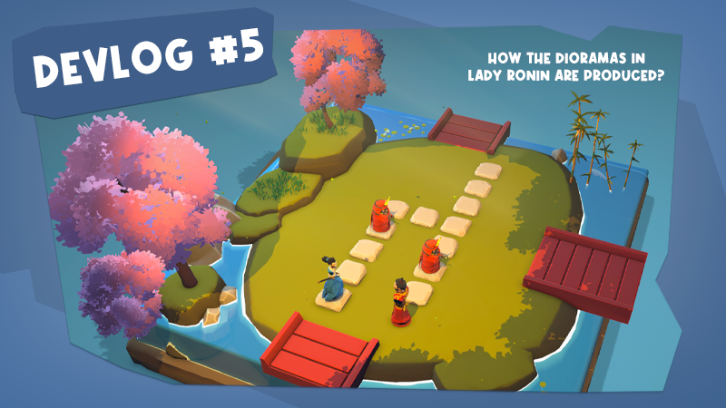
A Ronin's vision — How the dioramas in Lady Ronin are produced?
In their ongoing quest to refine Chessarama, the next target of our Art Team was the dioramas in Lady Ronin! ⚔️
Lady Ronin is one of the games from Campaign Mode. It’s designed to immerse players in a world inspired by feudal Japan. In this epic journey, our protagonist is a legendary Ronin on a mission to destroy an evil and unfair Shogun.
Keep reading today’s Checkmate Chronicles to discover the secrets behind the creation of Lady Ronin!
Setting the scene: illuminating the world of Lady Ronin
Our dioramas are deeply inspired by the Japanese culture. To kickstart this exciting transformation, our Art Team embarked on an illuminating endeavor to harmonize the visuals, crafting an immersive experience that perfectly captures the essence of Lady Ronin's world.
Some features we introduced were captivating god rays to our morning scenes, and enchanting particles to our night scenes:
Cherry blossom dreams: reimagining the landscape
As we worked to enhance the atmosphere of the game, we found inspiration in nature itself. While previously Lady Ronin's trees traditionally sported an orange palette, we recognized the need to align with the serene beauty of Japanese cherry blossoms! 🌸
Our Art Team undertook the task of transforming the tree color palette to capture the essence of these delicate blooms:
Crafting Lady Ronin's World
At Chessarama, not only biggest changes are made; our meticulous Art Team is equally dedicated to refining each level.
Consider, for instance, our approach to water shading. By introducing a more "stylized" touch, we've transformed the visual aesthetic, ensuring a harmonious fit within the game's world! 🌊
But we didn't stop there; the magic of Chessarama often lies in the subtleties. Our night levels, too, received an artful upgrade. Beyond the addition of particles, we took care to populate these levels with additional assets. In levels that are missing a verdant life, we introduced lush vegetation, enriching the surroundings. In others, a delicate touch of blue fog now shrouds the water, evoking an alluring ambiance.
It's our attention to detail that enchants Chessarama. In the end, the metamorphosis of Lady Ronin's dioramas serves as a testament to our commitment to delivering an authentic and captivating experience for our players. 💙
Stay tuned as we continue to infuse life and culture into the world of Chessarama!
And don't forget to add Chessarama to your Wishlist:
We'd also love to hear from you: what would you like to know more about Chessarama for the next chapter of Checkmate Chronicles? Write in the comments below!
See you soon! ♟️
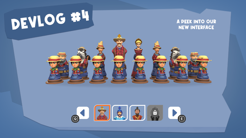
Chessarama redesigned: a peek into our new interface 🎨
Welcome back to Checkmate Chronicles, where we unveil the intriguing transformation tales behind the development of Chessarama!
For this chapter, we're shining the spotlight on a critical aspect of any game — the User Interface (UI). Strap in, as we journey from the wireframes of the past to our vibrant new designs. Ready to experience this visual transformation? 🖌️
Exploring the art of usability
The UI in a game acts as the gateway to its essence. When well-executed, it weaves effortlessly into gameplay, enhancing immersion and user experience. Our team embarked on a mission to redesign Chessarama’s entire UI, aiming for an interface that wasn’t just visually appealing, but also sparkled with joy and improved usability.
The UI's new version boasts a cohesive design, with recurring components that create a stronger visual identity. By maintaining consistency, we've ensured that interactive elements are instantly recognizable, thus elevating the overall user experience.
A deep dive into the new designs
Main Menu: With the game title taking its rightful place and the repositioned buttons aligned to the left, our main menu promises enhanced readability, providing the perfect gateway to our game.
Campaign Level Select: The improvements include a clearer indication of the status of the levels (locked, completed, all challenges made), a better contrast between text and background, and a more intuitive pagination.
Set Selection — Chess Match: On the new version, players can instantly see all sets available to select and easily identify that “Play a Match” is a button.
Gameplay — Campaign: On-screen displays now keep players informed about the current game mode and level. The “Close” button also features a more user-friendly text.
Gameplay — Battles: Enhanced button visibility, improved contrast, and a more user-friendly input indication system form the core of this overhaul.
Results — Battles: Now there’s a differentiation between challenges that were completed previously and on the current run. Badges mark level/match completion and all challenges completion. And it is clear which chess set will be received for completing all challenges of each Battle mode.
Pause Menu: The revamped pause menu is more clean, with game stats removed from it (since it is now available on the Level Select when accessed via gameplay) for improved clarity and user flow.
Profile: The new profile shows the player progress and stats in a more joyful way on the new layout, with more images and the information better grouped and organized.
Collection: The Collection has been refined, featuring grayscale for locked items, clear unlock conditions, and an expanded set view within the same screen for effortless navigation.
An interface transformed
Our UI redesign didn't merely focus on aesthetic touch-ups. Every screen underwent a transformation, raising the quality and consistency bar. Addressing previously identified usability issues, we've strived to make your Chessarama journey smoother and more delightful!
As always, we cherish the support and enthusiasm from our community. Feel free to drop your thoughts and suggestions in the comments. And if you haven't already, remember to add Chessarama to your wishlist!
Until our next chronicle, keep strategizing and enjoy the revamped experience! 💙
See you soon on the board. ♟️
Shades of progress — Revamping our diorama colors in Dragon Slayers
In the quest to evolve and perfect the visual storytelling of Chessarama, our Art Team has continuously faced challenges and puzzles off the board.
The primary question was: how do we keep players visually engaged, level after level? In this episode of Checkmate Chronicles, we'll delve into the visual progression of the Dragon Slayers levels.
The Chessarama canvas: a unique approach for Dragon Slayers
In Chessarama's Campaign Mode, players have been treated to a diverse visual landscape that shifts with time: from the morning serenity of Farm Life to the twilight ambiance of Lady Ronin, and the sunset energy of Street Soccer. Each game has employed a day-to-night transition to mark the player’s progression.
However, for Dragon Slayers, we took a different path. Instead of using times of the day as milestones, we leaned into the increasing challenges and the escalating path of destruction caused by the dragon.
The initial levels present a more "peaceful" atmosphere, contrasting sharply with the later stages overwhelmed with a "dark" mood, echoing the fire and devastation brought upon the kingdom by the dragon.
This shift wasn't just about aesthetics but was a conscious attempt to align the visual narrative with the game's rising difficulty and evolving storyline.
Initial choices and revisions
Our beginning was uncomplicated but lacked movement - a single brown shade was used for the entire Dragon Slayers background:
This palette provided a harmonious look, yet missed the dynamism we sought.
The aim was to transition from lighter to darker tones. Thus, starting with a serene blue seemed like a logical step. However, it became apparent that it resembled our "Lady Ronin" theme too closely, prompting us to change direction:
Diving deeper into color choices
Committed to finding the ideal palette, we ventured beyond primary colors, diving deep into various tones, illuminations, temperatures, and saturations. We ran different tests that included trying out different lighting scenarios, exterior floor color, and post-processing profiles. Here are some ideas that we explored:
We tried using different shades of blue and brown. For the final levels, we initially tried cooler colors with a low value.
Final palette: a descent into chaos
We settled on a visual sequence involving three color shifts. It begins with a subdued purple-blue that focuses attention on the board, transitioning to an orange-filled light as lava engulfs the diorama.
This shift isn't solely about aesthetics; it carries symbolism, reflecting the gameplay's increasing stakes.
The endeavor to redesign the Dragon Slayers background was a genuine challenge, but the end result was undoubtedly worth it:
Through meticulous design, color theory, and multiple iterations, we've sculpted a landscape that tells the Dragon Slayers' tale.
We hope that as players strategize their moves, they're equally immersed in the dynamically evolving world we've crafted!
We’re loving to share our artist process with you! Stay tuned for more insights behind Chessarama. 💙
And don't forget to add Chessarama to your Wishlist!
We'd also love to hear from you: what would you like to know more about in the “Behind the scenes” of Chessarama for the next chapter of Checkmate Chronicles? Put in the comments below!
See you soon! ♟️
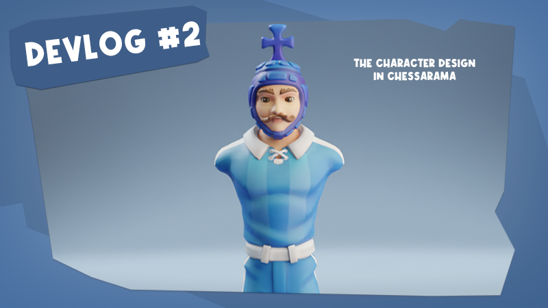
Do chess pieces have a mood? — The moodboard and character design in Chessarama
Today the Checkmate Chronicles will embark on the artistic journey of creating characters for Chessarama, a world where even chess pieces can express emotions and carry unique moods.
This devlog explores the creative process that brings life and personality to the iconic Street Soccer pieces!
The challenge of crafting chess figures
Crafting chess figures presents a unique challenge. While they are fundamentally chess pieces, we've transformed them into characters with distinct anatomies. Yet, they must still retain the clear legibility of traditional chess pieces. To achieve this, our approach prioritized adhering to the standard shapes of these pieces, ensuring that players can instantly recognize each one on the board.
Uniformity in Street Soccer
Unique to the “Soccer” theme within Chessarama, every piece wears the same soccer team uniform. The image below showcases the various design options for the soccer uniform, highlighting the decisive moment of introducing stripes, which further enhanced the sporty essence of Street Soccer:
This uniformity, while capturing the essence of a soccer team, introduced an additional design challenge. With each piece dressed identically, it becomes even more imperative to distinguish them from one another.
Unlike other Chessarama themes where outfit might differentiate pieces, in Street Soccer, the emphasis on the intricacies of the head and the iconic shapes of each chess piece became paramount. It wasn't just about dressing them for the game; it was about giving each a unique identity while ensuring unmistakable recognizability on the board.
The Rook's robust design
The Rook, for instance, stands as one of the more straightforward designs. With its stout and flattened structure, its signature feature is the flat top of its head. We aimed to keep this cylindrical and robust silhouette, staying true to its traditional counterpart.
Different hair variations for the Rook were explored to get the perfect blend of the iconic piece and the theme of the game:
After settling on a design direction, three distinct hair variations were further detailed:
The final sketch of the Rook showcases options with and without a beard, along with an informative callout highlighting the hair's top design:
This paintover captures the refined and polished look of the Rook, where the emphasis on hair detail is evident:
The Bishop's distinctive silhouette
The silhouette of the Bishop was quite challenging. Ensuring that the hair retained a "candle-flame" essence while also introducing unique breaks and cuts was pivotal.
This image showcases the Bishop's silhouette exploration, emphasizing the candle-flame inspired hairstyle. Variation D was selected for further refinement:
The Bishop's design encountered readability issues in-game. To address this, we tested the piece from different angles to ensure its silhouette was distinct and recognizable:
The Queen's royal elegance
Her design journey was marked by iterations, especially in her hairstyle.
When we create a Queen piece, we always focus on two things: the inverted trapezoid shape, and the crown.
To give her personality without losing the Queen shape, various hairstyles were explored, with the final choice being a braid:
Bringing pieces to the board
When we place the pieces within our dioramas, we create a dynamic gaming experience — the gameplay and the art need to be side-by-side to match unique encounters.
In Chessarama, every piece on the board tells a story, and the character design is a crucial element in conveying these stories.
We're excited to share our creative process with you, from the initial moodboards to the final, fully realized characters.
Stay tuned for more insights into the artistry behind Chessarama. 💙
And don't forget to add Chessarama to your Wishlist!
We'd also love to hear from you: what would you like to know more about in the “Behind the scenes” of Chessarama for the next chapter of Checkmate Chronicles? Put in the comments below!
See you soon! ♟️
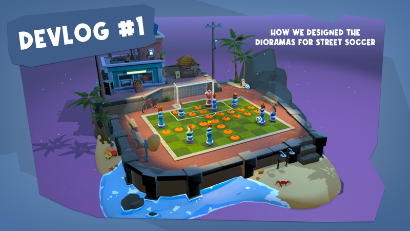
From sketches to final results — How we designed the dioramas for Street Soccer
Welcome to the Checkmate Chronicles, our devlog where we share the creative and technical behind-the-scenes of Chessarama!
In our inaugural post, we will unravel the artistic conception behind the dioramas of Street Soccer. Are you ready to dive into the vibrant aesthetic of street soccer? ⚽
This diorama showcases the typical Açaí place at sunset.
Street Soccer Diorama - Bringing the Brazilian flair to chess
When we think of chess and street soccer, the combination might seem unconventional, but in the universe of Chessarama, anything is possible!
Our latest challenge was to craft a diorama inspired by street soccer that evoked the charm of Rio de Janeiro. Our goal was to depict a lively, colorful representation that conveyed the dynamic spirit of the streets of the Marvelous City.
That's why we used some of the city's iconic elements as a reference to create unique scenarios - and allowed ourselves to have some creative freedom as well to bring even more joy to the dioramas!
Space restrictions as a creative challenge
With the diorama having a size of 16x16 units in total and the gameplay area already set at 9x8 units, there was a pertinent question: how to encapsulate the beauty of Rio in such a limited area?
Our solution was inspired by the hills of Rio. Despite these limitations, the artistic team endeavored to include both the hill idea and elements of the beach. The stacked houses, typical of Rio's communities, were also a key reference.
We composed a scene that mixes human construction and natural structures in order to translate the verticality and flow of the urban scene of Rio.
Influences and design approach
We aimed to portray a more colorful, joyful, and idealized Rio de Janeiro. We captured the city's essence by focusing on vibrant colors and a sense of community. Our depiction showcases toys on the beach, urban life, and lush tropical vegetation.
Our art's stylization was heavily influenced by Pixar. Within the Chessarama universe, objects such as houses and cars have proportions that diverge from reality. They're simplified and accentuated in their primary features. Details are kept minimal and exaggerated in size to ensure they're easily identifiable in the in-game camera.
This in-game camera perspective was pivotal for our design decisions. It was crucial that diorama elements were both recognizable and captivating to players, especially from a top-down view.
That's why we particularly focused on the rooftops, as they are prominently displayed during gameplay.
We added some details to set dress the diorama to suggest the idea that people actually live in this neighborhood.
Urbanity and dynamism
The Street Soccer diorama had a unique trait: its predominant use of concrete, giving it a more urban and squared look.
To tackle the challenge of instilling dynamism and preventing a too "rigid" scene, we turned our attention to floor plans.
Using floor plans is the best strategy to tackle complex environments and to plan them out before exploring them in perspective.
Using the floor plans as a guide, we could better grasp the flow and distribution of urban spaces, aiding us in crafting a more fluid and less orthogonal layout.
Rio, inherently, is a city that grew organically, winding and climbing its hills. This organic growth was integrated into the diorama, resulting in a chaotic yet stunning and dynamic urban depiction.
Brazil's traits
Beyond the backdrop, iconic elements of the city, like açaí, bakeries, corner bars, and street vendors, were incorporated. The tropical vegetation, emblematic of Brazil and especially Rio, was also meticulously depicted, reinforcing the diorama's authentic character.
These props were created to try and capture some of the peculiarities of Brazilian day-to-day culture.
We hope you enjoyed getting a glimpse into the creative process behind the Street Soccer dioramas!
It has been a journey of learning and passion, and we are eager to share more stories with you in our upcoming posts. 💙
And don't forget to add Chessarama to your Wishlist!
We'd also love to hear from you: what would you like to know more about in the Behind The Scenes of Chessarama for the next chapter of Checkmate Chronicles? Put in the comments below!