We apologize for any inconvenience you may have experienced with our Event Website. We've been working closely with Steam to get it back up and running, and now you can access the website as usual!
To make up for the time lost, we are extending the ongoing events period. Please make sure to check out the new extended schedule below.
1. June's Case Log Event
A total bonus of 2 days of attendance will be added to your accounts!
* We are working on expanding the number of bonus attendance days. * We will notify you through an announcement once it is confirmed.
2. Web Events Extended [2 Days]
[Try to Beat Nicky!]
Weds, May 17th - Weds, June 13th → Fri, June 16th 07:59 AM (PT)
[Nathapon's Compass Event]
Thurs, June 1st - Thurs, June 29th → Sat, July 1st 7:59 AM (PT)
We are sincerely sorry for the inconveniences caused.
We have prepared some event NP as a little token of appreciation for your patience, so make sure to claim it before it expires!
Coupon Code: WEBEVENT Reward: Event 200 NP (7 days) Valid Thru: ~ Friday, June 30th 7:59 AM (PT)
* How to use the coupon: Settings → Support → Use coupon * For any inquiries regarding the event, please send us a ticket through our customer support page.
We'll work hard to avoid this from happening again.
Thank you.
[Event Website] Login Issue Additional Information
Hello Lumia Survivors,
Upon completing the Event Website Maintenance we have confirmed that it is due to an error occuring in the Steam Platform.
We have already reached out to Steam and are awaiting their response about the origin of this error so we can fix this as soon as possible.
Once again, thank you for your patience.
We'll keep you updated if anything changes.
[Complete] Eternal Return Official Website Maintenance
Hello Lumia Island survivors!
We will be conducting maintenance to our official website on Sunday, June 11th (PT) to better improve your experience.
Check out the details below.
------------ ■ Eternal Return Official Website Maintenance
Duration: Sunday, June 11th, 6 AM to 7 AM (PT) [1 Hour] Purpose: Official Website Maintenance
The official website will be temporaily unavailable during this maintenance time.
* Please note that maintenance time may vary or be delayed depending on work involved. ------------
Thank you!
[Event Website] Steam Login Issue
Hello Lumia Island Survivors,
We are currently aware of the steam login issue on our event website and are working to fix it as soon as possible.
We apologize for any inconvenience caused and we thank you for your patience. (editado)
9th Dev Journal
Hello Lumia Island survivors!
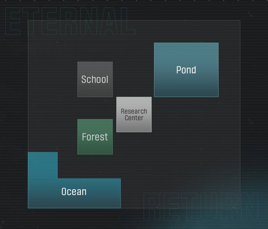
Welcome to the last update for changes to Lumia Island. As we mentioned in the 2nd Update, today’s Dev Journal will cover Pond.
As you all know, Pond is a very troublesome terrain. Because of the pond itself, it forms a giant O-shaped area with a pond in the center. It’s very wide, but because of its shape, most of it is a one-way passage, making gameplay a bit repetitive. The best way to solve an O-shaped terrain is to create a passage through the center.
Filling in the pond would solve a lot of problems, but we wanted to keep it because it is one of the most distinctive features on Lumia Island.
As the number of playable areas will grow to 20, new players may find it difficult to remember the terrain in every single area on Lumia Island. Each area, like Archery Range, Forest, Hotel, or Hospital, has its own unique characteristic, but with the change to 20 areas, we needed to make landmarks that stand out more.
For example, Research Center in the center of the map may be the first thing you remember thanks to its unique concept. Or if you're a student, School may be the first thing you think of. Once you've got a few of these areas down, you can work your way through remembering the others.
Water is also important to players' first impression of Lumia Island. Beach and Pond are often recognized first because their blue color makes them stand out. This is what we mean by landmarks being important for recognition. Depending on individual experiences, you may think of different areas other than the previously mentioned ones. However, for most players, Pond, Research Center, and Forest are the most commonly remembered areas of the current map.
So, instead of filling the Pond, we thought of ways that could make it more of a landmark.
We even considered building a bunch of bridges to improve the O-shaped terrain of Pond. However, since bridges themselves are often long, straight pathways, improvement would be too small-scale and the addition of too many bridges would make it look cluttered and strange.
After a lot of back and forth, we reached a consensus: a Launch Pad! We’ll be adding the Launch Pad from Cobalt Protocol to the middle of Pond. This will bring a lot more variability and different paths to the area. Another advantage is that, unlike other alternatives, we can keep the unique blue color on the current Minimap.
We will also install a Launch Pad to connect Pond to Cemetery. This will diversify the path that was once just a large bridge next to Pond and also help Cemetery’s left side. The current left side of Cemetery is a U-shaped terrain that isn’t exactly the easiest to navigate without crossing Research Center (unless you’re going for Tree of Life!). Now, the path to Pond will greatly increase the use of this area.
Be careful though! When using the Launch Pad, you may jump a little too far and end up in a different area than you want!
Inside Pond, the Launch Pad will open up a pathway like an “aorta” that runs through it. However, it will still need a few more improved pathways.
Previously, Stream could only be crossed with extensive mobility or by being knocked back by a Boar, but we’ll be adding a footbridge that will make crossing much easier.
Another problem with Pond is that there is limited access to all areas except Police Station.
There is also no Hyperloop, so to get to neighboring areas, you have to trudge through long pathways made up of mostly O-shaped paths. (The same goes for the Launch Pad leading to Cemetery.)
The area where the Boar was will now have a pathway to Temple. The path from Temple to Pond used to be a very long, straight path, but with the addition of this central passage, you will have more options available.
Another pathway will also be added near the path that connects to Fire Station. In the current map, this little area was most “controlled by pathways”—in other words, there was a lot of walking around pathways to get where you wanted. Between this and the central Launch Pad, you can now expect quite a bit of variation.
We will also be adding a new pathway that connects to Hospital. This area used to be a narrow path without any alternative routes, with Tree of Life and Hyperloop pretty close together, making it a notorious bottleneck when going between Hospital and Temple. With this new pathway, that issue is pretty much solved.
One thing we had in mind was having Research Center be a Safe Zone at the start of the game, then changed to a Restricted Area later on. However, we had to put that off because we needed to completely redo the algorithm for Restricted Areas. If Research Center can be opened in early game, you’ll have a lot more variety for paths in the center of the map that will allow you to come back later.
So far, we’ve talked about Lumia Island in three separate parts. However, because things are still in development, we’ve first focused on levels and pathways that will be created. In addition to everything we’ve already covered, we’re currently working on other optimization aspects as well, so detailed layouts may change and the quality of different objects will get even better!
Another big thing we’re focusing on for Lumia Island is Lightmaps. It was honestly annoying to calculate object lighting, reflections, and shadows in real-time. We’ll be making this much easier by coding lighting information separately and adding it on top. This will really lighten the load on the game settings and make the game run smoother. This lightmap will make a big difference for backgrounds, but it will serve an even bigger purpose by optimizing the UI and character models.
More information about this will be released in the update titled "Frame Report".
Next Dev Journal, we’ll be diving into another update for our characters. Stay tuned for exciting changes to even more of your favorite characters that weren’t included in the 1st Update. See you soon!
Web Points(WP) are event points that can be obtained and used throughout the Season 9 web events
Eternal Return 1.0 Dev Stream
Hello Lumia Island Survivors!
This is an early announcement for our upcoming Eternal Return 1.0 Dev Stream.
First of all, we'd like to thank you all for your valuable feedback on our Dev Journal. Receiving your feedback is key for our development process and we look forward to hearing it on our upcoming Dev Journals as well.
We're currently reviewing all of the feedback we've received, and we'll be hosting a Dev Stream in June to touch on that feedback as well.
We'll let you know more details of the stream soon so stay tuned!
Thank you!
[Complete] Server Maintenance Extension Notice
Maintenance is done! Please restart the client to download the update.
Hello Lumia Island survivors!
Today's maintenance has been extended.
We have identified an issue with the AWS server and we are contacting AWS for further details.
We'll try our best to complete maintenance as soon as possible.
We apologize for any inconvenience caused.
[Server Maintenance Extension]
June 7th, 07:00 PM - 11:00 PMJune 8th, 01:00 AM (PT) (2-hour extension)
* Depending on the circumstances, the maintenance may be completed earlier or extended further. * We will provide additional updates if any changes occur.
Maintenance Notice
Eternal Return will undergo temporary maintenance for an estimated time of 4 hours on June 7th at 7 PM (PT) to update Patch 0.86.0.
* The game will be unavailable during the maintenance period. * Please restart your client after the update. * Use of the event page may be limited during maintenance.
Thank you for your patience!
8th Dev Journal
Hello Lumia Island survivors!
Today’s Dev Journal will cover changes to Saved Plans. Saved Plans are one of Eternal Return’s most complicated systems, but also an integral part of the game that makes it stand apart from others. Many of Eternal Return’s core players find a ton of fun in figuring out the perfect Saved Plan. As we plan to change a lot of elements in the game for official launch, we knew we had to do more research into not only how to change Saved Plans for the better, but also how to make sure our players continued to have fun with the research process.
However, for players brand new to the game, Saved Plans can be an overwhelmingly difficult system to understand. At the end of last year, we conducted a play test with about 50 new players. What we found was that many players were frustrated because as soon as they finished the tutorials, they were thrown straight into their first match. Even before they played a single round, there was too much information was thrown at new players, making them confused.
Searching for the perfect Saved Plan and creating a strategy is one of the most complicated parts of all our menus. From when we first launched with our first Alpha build, we added a ton of functions to the Saved Plans, and last summer, we made large-scale changes and reorganization. That reorganization added late-game items, Remote Drones, Augments, and other necessary features that expanded the scope of Saved Plans to encompass even more. (Before that, Augments weren’t even connected to the Saved Plans, and players had to use external websites to find the perfect Augment for the character they wanted to play.) However, this necessary increase in functions led to significant decrease in intuitive UI. Sure, we added a ton of new functions, but unless you used them repeatedly and became a master, you wouldn’t know which button to press or which function connected to what.
The goal for improving Saved Plans is to make accessibility between game preparations and the strategy menu even better. We want to help brand new players understand how to prepare for the round ahead. Additionally, players who start getting into the game can go into the strategy menu and pre-plan the perfect strategy. The current Saved Plans don’t need new functions—rather, they need to be reorganized and refined so they aren’t as difficult to understand.
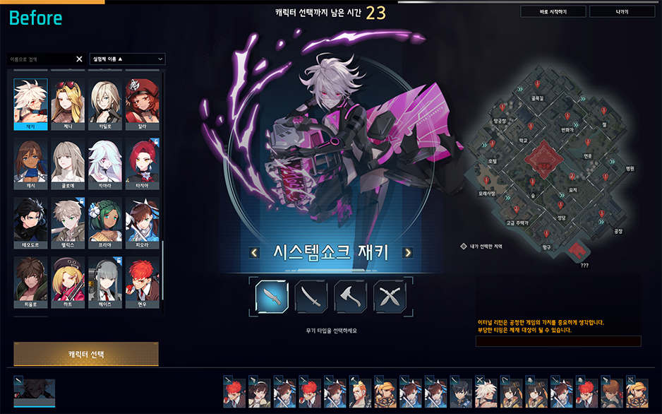
First, we’ll be deleting the map from the character selection screen. The screen is divided into three sections: Character selection - Character picture - Minimap. However, this divide makes it tough for new players to learn the menu. We wanted to switch to a two section screen to make things much easier. With the new widened screen, players will be able to see more Test Subjects at one glance.
With this change, the flow of selection will also become more convenient from left to right. Choose a character, choose their weapon, pick a skin, hit the “Character Select” button, then move onto the next page. It’s that easy! Previously, you would have to keep looking all over the page to select what you wanted, but this new selection will be much more streamlined.
After character selection comes Saved Plan selection. Previously, you chose one Saved Plan from a list of available plans made by other players. Because of this, the screen was littered with a ton of icons that were tough to read by the time the game started. Quite a few players also didn’t understand that this was a list they could choose from.
Changing this screen to a two section screen makes it much easier to read while also greatly reducing the amount of information displayed. Masters of the game who are able to process a lot of information in a short time may prefer the old screen, but for beginners, it was too overwhelming. They won’t be able to process everything needed in the less than a minute prep time.
At first, we wanted to make and add another tutorial about game preparation to solve this problem. However, during our beginner’s focus test, we noticed that if there was too much explanation regarding game mechanics and functions, players often just skipped over it.
Overall, UX shouldn’t need an explanation—we believe the best UX should be able to explain itself. The new screen will now clearly show that you need to choose your Saved Plan, tactical skill, and Augment before you can start the game.
Additional information and functions will also be available. For example, if you press the F button, you’ll be able to see the other characters picked for that round. You’ll also be able to change your selected Saved Plans, tactical skills, or Augments by right-clicking.
This will make the connection between each function even better. Now if you change your Saved Plan, it will automatically change your tactical skill and Augment to the recommended ones from the Saved Plan. Before, if you wanted to change your Augment, there were a few steps involved, but now it will be easy to instantly change or modify an Augment based on what the Saved Plan recommends.
Previously, when you selected a Saved Plan from the list on the right, it would change the map next to it on the left. If you ask us, this broke the fundamental laws of universal UI design. Now Saved Plan selection will follow the left to right principle, the menu will drop down below it, and the map will change on the right.
Another enhancement we’re making is the visibility of the chat box. There are plenty of times you need to chat with your team while you’re preparing for team modes like Squad and Cobalt Protocol. However, with the current layout, it’s hard to even tell when someone’s sent a message in the chat box. We’ll be moving the chat box to the bottom-left of the screen both in lobby and in-game so it’s much more visible and easy to use.
Like we mentioned earlier, our goal was to make game preparation much easier for beginning players just trying to understand the game. While the strategy menu isn’t for complete beginners, it does offer an intuitive way for players getting used to or enjoying the game to find Saved Plans, modify them to their preferences, and slowly create something entirely unique to their play style!
This is what the Saved Plans menu looks like at first glance.
The existing screen has so many different functions cluttering the screen that it’s hard to even know where to focus. As you can see in the second screenshot, the Edit button is much more visible, and other actions, such as deleting a Saved Plan or checking IDs, can be found by clicking the three dots. While we kept the same functions as previous game preparation, we moved recommended Augments into Saved Plan editing as they didn’t exactly fit the context previously.
For the Saved Plan edit screen, the existing menu shows everything you might need which could get overwhelming. The new screen will divide each menu and the necessary information into different phases so that there’s not too much information being thrown at you at the same time.
If you’ve become used to the old screen, you can always see the summary on the left side of the screen. However, there was admittedly too much information and it wasn’t organized very well, so players didn’t know what was clickable and what wasn’t. A lot of player feedback mentioned this as being too complicated and hard to understand.
On the new screen, the left side will feature clearly clickable buttons. We’ve also separated the Auto-create Saved Plan feature which was the most complex part of Saved Plans. This means you’ll only be able to use this function when you want to.
You can also see how convuluted the current UI is when you look at the Augment menu. Augments will now be changed so players can quickly and clearly see Primary / Secondary and Core / Sub Augments. The Augments will now appear in a square at the top of the screen and be strung together in a line. This way, you will be able to tell the difference between the Augments as it wasn’t very clear before.
(Note: This image is only a preview and could change before official launch!)
Selecting Augments will now start from the top and go down, giving it a more natural left to right flow that is easy to follow.
First select Primary Augment,
then select Core Augment within those.
Next, choose the Secondary Augment
and select your Sub Augments!
You'll be able to choose them in order, starting from the top. The newly introduced tactical skills are configured to be even easier. All you have to do is select one to see its text and a video showcasing detailed effects.
We’ve also improved the layout of the Search Saved Plans function. When you click on one of the vertical lists, the area on the right should change as well. However, in the current search UI, the top and right of the lists change at the same time.
We’ve adjusted these elements so that it flows more nicely.
Overall, our goal was to get rid of the awkwardness of the current Saved Plan system UX, adjust the amount of information players see on screen, and make the flow a lot better. With these changes, we can make Saved Plans—one of the most complex systems in all of Eternal Return—much more user-friendly and fun.
We understand that this change in UI flow may be strange for players already used to how Saved Plans work. This is because even a good UI isn't as good as an already familiar UI. But, realistically speaking, the current Saved Plan system is a blockade for new players and something even users who play a lot struggle with. Thus, we decided it was something that needed to be changed.
We will cover more changes to the UI relating to Mastery and Crafting in future updates, so we hope you're looking forward to it!
The next Dev Journal will be our last look into Lumia Island's new map and will cover changes to Pond.