Hello All, I will keep this short, as sometimes I can ramble on and it is all very busy here. I've been trying to figure out a few different things, from the level aesthetics for Collisions, to UI Designs and other stuff. It has been a very busy couple of months. Firstly, I did the big heave ho move back to London and this has affected work. It has made it considerably harder for all of the team and the emphasis on communication has become more important than ever. We keep communication going by having video meetings every morning with Google Hangouts. This helps to establish the day and keep in touch with the team whilst discussing any problems and for feedback too. The other important aspect is that it helps keep up my morale and to be social with the team, because working at home is a lonely job, even with all those homely perks. Sometimes the connection on Google hangouts can be bad meetings can be bad, with stuttering and lag, however you have to put up with it and work through it. In emails, online chat can be misconstrued as cold and rude, but remember, this is online and it is tough to convey emotion, To circumvent that, I ignore the first response in my mind, because I know the team member is trying to get to the point quickly.
Other important aspects are to maintain focus and professionalism while working on project: working away by yourself at home does have its perks, however, you'll get distracted with other stuff in the house. It's easy to knock off early, or do something else. However, you have to have a strict timetable and rules to stick to, like all housework, shopping, going in the garden, even if it is sunny, is to be done after five pm, not before, because from nine to five is for work, the garden can be visited as a lunch break reward. Then when it's five, I stop, I don't do any more work after that, I just move onto personal stuff, because work and personal life start to blur when working and I may end up getting into a habit working all day and night with no separation.... That would be bad. So don't do that, have a break!
The Level
Work wise, I spent a few weeks working on one of the levels called Collisions. It's still a work in progress, but hopefully you will see a version of it soon in the next build.
The level has come a long way in a short time with development and the playtesting feedback we got a week or two ago has helped us to refine a few issues with areas for the player. One example was that some players were trying to click on unreachable glitches, so those have to be amended and hidden better.
The UI
I have been working on and off on the UI, most of the time has been spent experimenting with Patch cord patterns. We decided that we would need to have two different patch cords as just having one wasn't helping the player distinguish between interactive non-interactive patch cords. I have not been happy with the development progress of it, as some of the aspects haven't worked yet, I am sure it will get there, however, for the meantime, it's more head-scratching, time and research.
More to type, but I have run out of time Again, I did not keep this short.
Hi there folks! So just over a week ago now my fellow budgie Kayleigh and I attended an event being held in Edinburgh's Mash house called Games Are For Everyone (GAFE). The event consisted of a handful of games (including Glitchspace) in a relaxed environment (including a drink or two) and an unexpected surprise (16 piece orchestra, which was awesome might I add).
This event was unlike any I've personally attended before and felt more like a games night round at a friends rather than an exhibition which I found broke down the barrier you can sometimes face between audience and developer. The people were friendly, the atmosphere was wonderful and the time flew by so fast that we were saddened when the lights came on for the bar to resume its normal evening purpose.
GAFE was the first time we'd really brought Alpha 2.0 out to the public and considering how much change the game has undergone in the past few months I know at least I was a little nervous about showing it, thankfully the reception to the updated Glitchspace was resoundingly positive and it was a relief to see people having a genuinely good time playing it and even watching other people play it. At one point in the evening it became a group task solving the puzzles with people watching it on the screen giving helpful instructions to the perplexed player in the hot seat.
It was an incredibly enjoyable event for the both of us, but it was also really useful. We treated the evening as a mini play-testing session taking turns making notes on the current players actions and frustrations or talking to the people watching about initial impressions and aesthetics. The information we collected has been quickly whittled into a hit list of issues to fix and improvements to make in time for our official public release of Alpha 2.0!
Thank you to all the people who played Glitchspace at GAFE and also to Andrew Dyce for organising and inviting us! We had an amazing time so invite us to the next one!
Another week's gone by and there's been another series of design refinements from us to report. Some of these gifs are from old game builds but they help to illustrate what we've been wrestling with.
Much like the subject of the previous post, play-tests have been such a crucial component in getting this update right. Aside from fixing the placement of assets in our level block-outs, issues with spacial awareness and line of sight, it has also helped us to understand the various play patterns present in the game.
An interesting thing to report on is the length of this update. Initially we thought it would take about 30 minutes to complete, however what we found is that players new to Glitchspace were taking on average over 2 hours to finish it. Users that know what they're doing (either excellent problem solvers or those with experience in programming) take around 1hr 20mins to finish it. So it's quite a meaty update for our users :3. This will very likely mean that the finished release of Glitchspace's story mode will clock in at more than our 2-3 hour aim we had last year.
However, one of the biggest cruxes we've been wrestling with is in trying to fix this behaviour, especially with new players:
Whilst we've been doing some hardcore iteration over the past several weeks, Like a whack-a-mole it keeps popping up at every play-testing session we have done with 2.0 and it's proving to be very difficult to fix. In fact it's been a problem with the game since day one (that's over two years ago!) and we have to get it resolved before we go any further
When speaking with players about why they were doing it, what we realised is that the problem was actually the way connectors were being presented. Whilst players were usually associating connectors of the same type with each other (though usually isn't good enough...), many were also then trying to connect outputs to outputs, as opposed to outputs to inputs. This would result in players then trying to overlap nodes on top of each other, thinking that the solution was then this:
We then realized that this would also be completely game-breaking as you'd have layering problems with being unable to access the node that you just let go of. Overall, watching people do this every time has been incredibly soul-destroying as it just feels like a personal failure on our end. It also causes people to just turn off from the game in the first 10 minutes.
So we've been hard at work at coming up with solutions. Initially we thought that using glows like this would fix it. Nope! Not only was it difficult to make them look visually in keeping with the rest of the game, players just weren't getting it...
Robin then had a better solution. What she produced below is the closest that we have ever been in getting this problem resolved:
Players have responded well to it, but sometimes the meaning of these short animations (there's quite a few) gets lost in translation and misconstrued. We also thought that our tutorial was going to be too long at 10 puzzles but we're likely going to have to either increase the count for a more gradual difficulty ramp or alternatively restructure to allow players more time in getting used to connecting & dragging functions. We'll be investigating these two possibilities for after 2.0 as we're behind where we wanted to be in getting this finished.
There's certainly been other challenges with the UI and level designs that we're fixing but on this problem, we're all ears from our readers and would love to hear from you either in the comments below or by sending us an email on any ideas you've got in how to solve this. Once we've got this problem out of the way, we'll be ready to start shipping 2.0 out (so please let us know your thoughts!).
I'll leave you with another gif to gaze at until the next update:
Hey folks, Kaye here to give you another exciting update!
As some of you may have heard, we had a playtesting session recently (well, a couple of weeks ago now), which was very insightful!
During the session we were primarily looking at areas in which the player may get confused or lost, be it within the level itself or the UI, it was also worth noting how long it took our lovely volunteers to play through it all.
Fortunately nobody got so frustrated at playing that they felt the need to throw office furniture around the room, so I'm calling this one a success!
Overall though, the results were very interesting. Naturally there were a few lost souls, unsure of where they were or where they were going, but eventually they found their way.
There was a key issue with the interface when connecting the nodes which resulted in the players being unsure if what they were doing was correct or not, even when they were. We've had many discussions at great length on how to solve this issue and help to clarify to people when they have correctly joined two nodes. This seems to be an ongoing problem for some time, for now we're experimenting with different visual effects, like indents or outlines, but these may just be temporary fixes until we work out a more elegant solution.
The most apparent bug fixes were that of the level layout, which is what we've been tidying up for the last two weeks. Ripping apart whole sections of levels and rebuilding them to help clarify areas, and to stop cheeky players being able to get into areas they shouldn't and getting stuck!
As some of the puzzles weren't immediately clear in their solution some players would attempt to solve the following puzzle. This led to further confusion. In order to avoid this happening we've established a rule of making only one editable red block to be seen at any one time when possible.
And finally we've been working on adding more lighting to areas which were severely under lit.
Well that's the abridged version of our playtesting results!
In other news, we got shiny new business cards!
You fine folks can see these business cards in person this week if you're around Edinburgh on Thursday and Friday, as myself and Robin will be representing Space Budgie at the "Games are for Everyone" event at the Mash House on Friday staring at 7pm as well as the "Scottish Design Summit 2015" on Thursday from 9am at the Edinburgh International Conference Centre. It's gonna be an exciting couple of days and we'd sure love to see you there! And we'll be bringing along a version of 2.0 to play too! :)
Yesterday it was announced that Gitchspace, as well as several other amazing looking titles that you should check out, is to be featured as part of a playable exhibit of over 100 games spanning the entire history of the medium: Game On 2.0.
A winner of the best educational game category, we're all really thrilled for Glitchspace to be a part of it and we'll be providing a preview version of alpha 2.0 for the exhibit so that attendees can check out the new direction of the game when the showcase opens on May 23rd.
This week is just going to be a very quick progress update from us as we've got a busy few weeks ahead in getting this update finished.
So in terms of where 2.0 is at, as of April 30th, it's playable from start to end. In retrospect it's been insane the amount of production work that has been necessary in getting the first 20-30 minutes of the game flowing in the right direction. Guess that's what you get for choosing to rebuild your entire game whilst delivering an appropriately sized update in such a relatively short space of time. So that's the good news from us!
The bad news is all of the play testing and polishing still do in just a few short weeks... (It always feels like the last 10% of development for these updates is the hardest!). Here's a list of what is still needing to be integrated:
1) Play testing; aiming for this Friday.
2) Iterate based on results.
3) Integrate the 2.0 soundscape.
4) Lighting Pass.
5) Aesthetic Pass; basically assets that make the world feel more alive and less barren.
6) Deploy builds and test them across all three platforms - PC/Mac/Linux.
7) Finalize new branding/promotional materials & trailer.
8) Release.
Our biggest concern is actually not getting the first 6 finished, but probably the lack of PR lead-time that we're going to be leaving ourselves. We also had another deadline this week that we've been working towards, which has made everything pretty tricky to balance. You'll all hear about that in a new post very soon :3.
We're getting there though and the end for this rebuild is in sight!
[Just as a side note, we mentioned before that we were aiming for the end of this month for 2.0. We'll need to delay it for about 3 weeks to give us more time to finish it off, so apologies from all of us on letting it slip!]
Hello all
How are you? Enjoying the longer days? The brighter sunshine? The warmer weather? I’m not, I’m still stuck inside. It has been a while since my last blog up and it has been a roller coaster of development for myself. The last few weeks I have jumped from concepting character arms, UI creation, UI animation to the UI Bootup. The last week of development has been focused on UI. There is so much work that goes into the UI and I have learned so much, however, there is a ton more to learn.
The last time I left you all was here with the gray icons. Obviously we could not leave them like this:
I went through a few variations, these were some of the rejected ones:
Screen tests done with the variations:
Here is the current colour version, not much has changed, going through subtle variations; we decided to keep it simple:
A week later, we hit another snag (along with transparency issues that we had). The subtool menu was not going to work in its initial form. The original idea involved using the shapes of the functions for the canvas…… As previously mentioned on the Judgment Day UI/UX blog post. I initially wanted to avoid creating more icons for the functions in the subtool menu it would've entailed a large job:
Here are the test versions of subtool functions with some variations in the look of the them.
So after the testing, I inevitably knew the change had to be done and at first I resisted! But ultimately I agreed with the rest of the team that the function icons in the current state would confuse the player and would be a mess. We had to make unique icons for each of the functions… and there is a lot of icons! So I went off to a corner to cry.
After crying, I got away from the PC and doodled out some icon designs. At the same time, I researched how other designers approached doing their icon designs. I did this for inspiration and to help designing some of the icons. Also, I did pester Gaz too for some of them. See the snazzy doodles below:
After the doodles, the initial batch of subtool icons were created and these are the ones currently being used. Some of the icons that were created include Colliding Object, Main Object, Apply Force & Translate Object.
The new icons received positive feedback from the team and I wholeheartedly agreed it was an improvement and again went through a process of iteration and I thought I would share some examples:
The next step with the subtool icons was further research and to doodle them out, and took a couple of weeks of work... However, all in all, I am satisfied with the progress of the UI. It has still has a way to go, nevertheless, but we will get there.
So, this me, signing... off... See you ne..!? Oh wait! I got more to write..... I forgot about Animation the Icons and UI.
The last couple of weeks I have also worked on animating the Icons and UI (I say trying, because, I have got back on the animation bike and got a little rusty). Here is a couple of GIF images for the Glitch animations:
Do bare with me over the next few weeks, as these will not be the final animations for the game, as they will be worked upon and improved (well they better improve!).
One of the things that we planned and worked on was a boot up sequence for the Tool's UI. I spent a little time on this, but it still needs some more work. I've learned that whilst creating these new glitch effects for the UI boot up sequence, that we should use them on the next iterations of the glitches that I make for the UI.
I have not forgotten about the Character Arms concept art, I will have to show that another time. Time has run out and I've got to get back to work. Seriously, this blog has taken too much of my time, I blame myself for that.
A big part of Glitchspace is puzzles. Without them, the programming experience would just be incomplete. Therefore, for this post, I wanted to take the opportunity to talk about some of the processes that we went through in designing the puzzles for 2.0 (note that I won't be showing the programming interface here as I don't want to give the solutions away!).
With Alpha 2.0 we have put a lot of focus and attention to detail on their design. The update will have 30 different puzzles, broken down into the following concepts:
Level 1 - Translation (also acts as the tutorial level).
Level 2 - Collisions.
Level 3 - Forces.
Each level has around 10 puzzles each, breaking down their respective concepts. Choosing these three as the initial programming ideas to be introduced to the player were deliberate choices on our part and were chosen for the following reasons:
One of the issues that we have with current 1.x versions is that there was either just too much of the same concept being thrown at you, or alternatively a concept was introduced, dropped for x amounts of time, before being suddenly reintroduced at point y of the game that just didn't make sense. And x + y didn't even add up in the first place! The result was players getting bored before a concept was even over, with the game's flow and pacing feeling disjointed. The balance of the mechanics just wasn't there.
Therefore, in making these levels, a unifying goal that we had throughout was to make each puzzle feel unique. This would allow the player to explore the possible applications of a programming concept in a multitude of ways, whilst at the same time seeing the game's programming logic from a variety of angles. We also wanted to have a sense of interplay or connectivity with the environment around you, something that the current version lacks.
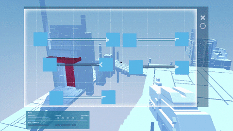
To do this, we went back to the machines that were built:
As a platforming element they were cool, but we knew that we could do so much more with them. So... what else? Well previous posts have mentioned how we have data flow as a navigational tool, but that it also acts as another obstacle for the player. So in this case, contact will result in your death (or some sort of tron-esque "dematerialization," thingy):
There's several others that you'll see in 2.0, but one of the more complex obstacle ideas was in doing this with them:
Robin and I also talked about having animated stairways; think of the seats that you'd see in an indoor gym that contract into the wall when not in use:
Another area that we wanted to push for in the puzzle designs was for an extra layer of challenge by having multi-step puzzles. That is, puzzles that require more than one piece of programmable geometry to be solved. The result is that it also allows us to recapitulate previously introduced programming concepts in a way that feels fresh and different to the player. 2.0 won't see anything too taxing here, but we'll be building on this as we release subsequent updates (can you figure out how the one below could be solved?):
As we go towards the full release the concepts will increase and the number of puzzles to go with it. With this the complexity of the programs that you make will increase too in a much more consistent manner. We'll likely be reintroducing all of the concepts that were used in current 1.x versions; we just need to figure out how they'll be reintroduce, where and why they should have a place in the overall game experience.
Over and out,
Ronan.
Dev Blog 10 - Developing the ToolBox
Available here - There is video too so follow the link for the full post!
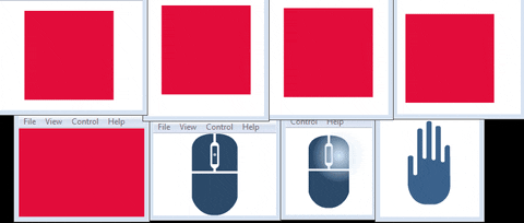
This week it's my turn again. I've been working on a lot of exciting new things recently so it's been hard to choose what to talk about! I've settled on talking about the ToolBox or what used to be the gun. So hold onto your internet capable devices.. it's gonna be a bumpy and disjointed ride through our tools history.
So it all started with a gun... or really just a placeholder cube with a slightly smaller cube that fired other even smaller cubes at other cubes. During early iterations of the game we were trying to get just the concept of firing programs at objects and getting them to change on impact so having a gun really did make sense. We even had little guys who followed you around in the creepiest of manners that you could cause to be shot up using the precursor to apply force or blocked using a createobject mixed with a stretchobject. These little enemies again made a gun feel like the right choice and so it was developed through many iterations..... (just a few as an example)
....until finally it came to this. The gun that currently sits in the game.
But as the gun developed so did the game and what once seemed appropriate to be a gun started to feel less and less like the right way to go. So here's a mini breakdown of the pros and cons to having this as our programming tool:
Pro
- Gives the player an obvious on screen tool that they are using to edit geometry.
- It is a nice looking gun...
Con
- Why is it a gun? (Common question from our audience)
- Gun not really used until near the end of the current version of the game?
- Hard to tell what is being used for what.
- Mostly static until you get to encrypters/decrypters.
- Again... gun? No enemies? Is this call of duty? When do I get to shoot stuff? Am i even using the gun now? (usually no.)
Result: While it's nice having something on screen that's obviously aiding the player with the editable geometry there really is no need for it to be a gun especially when it's not being used as a gun for close to three quarters of the game.
So where do you begin when it comes to creating something that needs to work both short and long range that isn't a gun? We had a few people during our expeditions to protoplay and game city suggest maybe something like the antichamber tool which while clearly isn't a gun does function as a ranged dispenser of cubes.
Antichamber
So we scuffled around trying to find a direction to go on that was vaguely gun shaped but not gun shaped with suffice to say is not an easy task. We looked for inspiration from everywhere we could from carpenters and opticians tools to dentistry and sextants. Suffice to say there are some really scary looking tools out there! There were quite a few ideas came up with but nothing was really sticking out as the direction we needed to go in. Everything seemed to be too complex or using shapes that just didn't fit in with our world.
So we tried something else... Perhaps instead of a gun the character could have more of a direct input with something either built in or attached to the hand? Something a little more similar to Q.U.B.E maybe?
Q.U.B.E
Again we tried a few different iterations with this idea but it all seemed far away from what we were needing and considering our characters design is still very much in flux how did we know that there would even be a hand at all?
We took a step back. Thought about what was important to get across with the object and what we would like it to do.
We wanted it to:
Be simple in shape but easily recognisable
Be representative of both types of use, (single block editing and multiple block editing)
Be based more around movement
Have more of a link with the programming canvas
Have the option to transform when it's use changes
This was still a very confusing point to be at. While we'd manage to hone in a bit more on what we were needing we still had little idea of what actually could fit that space. I started looking more to the geometry of the world we'd created and I was reminded of puzzle boxes. Mus brought up the hellraiser cube and how that moves in interesting ways and we started to head in the direction of having a cube as the base for the tool with its interest being brought in through a variety of animations and glitches.
Enter cube designs! Considering the whole idea was to have something that wasn't too detailed to begin with but was made more interesting by movement, static concepting clearly was a little tricky for this. There was plenty of wild hand gestures and odd explanations for how they could move combined with gifs which sort of half represented how it could potentially move...
After explaining a bunch we narrowed it down to two possibilities but in order to choose we needed a better representation for it's idle state, its open state (when the programming canvas was being used) and it's initial glitched state.
Enter door number one and door number two.
From here we chose door number two, it had a lot of potential for glitches and it's idle state was simple enough to compliment the world but could easily be made more complex by being broken down into smaller cubes. Which was particularly useful when it came to think about how it would open up to reveal the programming canvas.
I went on to do some more planning for how it could move and what could be contained within it's core when it opened up. This really needs to be turned into a proper document but with so much going on It felt quicker to do it this way.. I can make a document a little later on.
So here it is, our Toolbox in it's current form [Videos through the link]:
Hi folks, Kaye here, back again to give you another instalment of our exciting art process! This week I'm going to introduce you to my exciting life with particle systems.
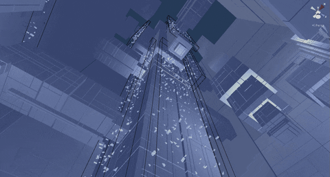
Now, before I get started let me just give you some background information on why I was working with these particular particles. The particles I've been working with are going to be used to represent the concept of data flow. They're generally used for aesthetic purposes for the time being but they hold potential for a lot more as development continues. They do ultimately work as a sort of basic guiding system for the player at the moment as the data always flows in the direction towards the final portal but they also hold the potential to pose as a life threatening obstacle for the player throughout the game. So with that in mind, lets get to how I've gone about creating this.
I initially did a few mock ups on how I wanted it to look within the level.
But you can only really do so much with a concept, to really see how well this is gonna work out I need to tweak it in game. Jumping back through to Unity so I can really familiarise myself with their neat particle system. Now this part of the process was very much largely just trial and error, seeing what works and what doesn't. There were a few important factors I needed to take into account though when creating these flow systems;
1: The data flow should be seen in all areas of the game (both light and dark).
2: The flow should lead the player towards the final portal.
With that in mind I began working on my trial and error process. Now, I began working primarily with Robin's placeholder particles which consisted of a sea of particles. We had an idea of introducing the player to the data flow with a small sea of particles, this allowed the player to see the data up close, watch the direction of the current as well as the potential to learn the valuable lesson that the data flow is not exactly friendly.
In order to make sure the data flow didn't overshoot and kill the player past this point I constructed a sort of barrier so enclose the particles.The problem with this is that it really wasn't that appealing visually.
Now this process took some time trying to get it to look "right" but ultimately it was scrapped. It portrayed the flow in a way that just didn't work out the way the team wanted it to so we went back to the drawing board.
Putting that area's data flow on hold for now I moved on to the next area. Here I tried creating a sort of reverse waterfall leading up towards the final level portal.
Once again though, I've found that this was still lacking in what I really wanted the data flow to really look like so I scrapped that idea and found myself back at, the ever so familiar, square one. I feel like at this point I really was focusing on the wrong thing as I had yet to decide what the particles would be made up from, how dense (on average at least) they were going to be, etc as all of this would affect the overall appearance. My solution to this was to take a much closer look at what I felt the particles should really be. A lot of the previously made concept art by Mus and Robin illustrated the data flow as being made up of different shapes and sizes rather the the plain square planes I've been using.
After plenty more tweaking of shapes and sizes I did eventually come up with something that we liked, but something was still missing, it was still lacking something.
After some deliberation about the visual effects of the data flow we settled on adding a haze. This would also help it stand out from the sky, though this created a new problem; what colour is the haze going to be?
After creating over 30 haze gradients of varying hues of blue and purple we finally settled on a very pale blue. Although this didn't address the problem of standing out against the very pale blue sky of the later levels. To get around this I added a light which gave the haze an added brightness to help it stand out.
You can see here how different the colour of the sky makes the appearance of the particles. Especially without the help of the other geometry to help break it up.


 But as the gun developed so did the game and what once seemed appropriate to be a gun started to feel less and less like the right way to go. So here's a mini breakdown of the pros and cons to having this as our programming tool:


