Travel through rifts to other worlds where you’ll solve a series of escape rooms, puzzles, and other mysteries, working together to overcome each challenge. Together, you’ll need to think outside the box, and then escape from it.
If you’re at the event, come find us on the Kwalee stand to chat with our team and see if you have what it takes to solve the puzzles and escape the island.
If you want to get a better idea of what In Sink has to offer, check out our announcement trailer here 👇
Looking for your missing piece to the puzzle? We’ve got plenty more for you to sink your teeth into.
Don’t forget to wishlist In Sink, join our Discord server, and follow us on social media!
Developer Diary #3 - Colorblind Accessibility
Welcome to our third developer diary!
Today we will be taking a look at how incorporating colorblind accessibility has profoundly changed our approach to our game design!
It was only after we released the Prologue for In Sink that we started to realise that some of our community members were having issues with the colors. Many of these players were either colorblind themselves or were playing with colorblind friends, partners, or family members, and they were finding the color-coded puzzles to be very difficult as a result. We wanted to resolve this issue and make In Sink a more accessible game for colorblind players, but we also wanted to retain the fact that our game was language-less. The big question was: What else could we add to our puzzles to help players describe certain elements to each other without using language in any way?
The answer was to add numbers and symbols!
Now everything that has a relevant color also has a symbol and/or a number associated with it, so the game can be played entirely without describing a single color!
The symbols in the game are in a 4x4 or 3x3 grid with the inspiration coming from the game Keep Talking and Nobody Explodes. They are easy to describe so as to not add an additional challenge for our colorblind players. For example, looking at the symbols and numbers featured in the images below, “two diagonal lines” or “Lever number 8” are both two simple ways to summarise what you are seeing.
In short, we wanted to give players as many options as possible for describing what they are seeing to each other, rather than limiting it to colors only. This has changed the way we approach the design of our puzzles and has brought up even more interesting discussions, such as how people describe certain symbols, why they choose to describe them in that way, and what signifiers do people naturally default to when solving puzzles (i.e. do you prefer to use the colors, the symbols, the numbers, or a mixture of all of them?). Rather than limiting our puzzle design, it has opened up new avenues for consideration and has left us with even more to talk about in future dev diaries!
Looking for your missing piece to the puzzle? We’ve got plenty more for you to sink your teeth into.
Don’t forget to wishlist In Sink, join our Discord server, and follow us on social media!
Time to Sync Up with In Sink 🧩
When you’re trying to find the perfect co-op partner, make sure you don’t faucet up 🛁
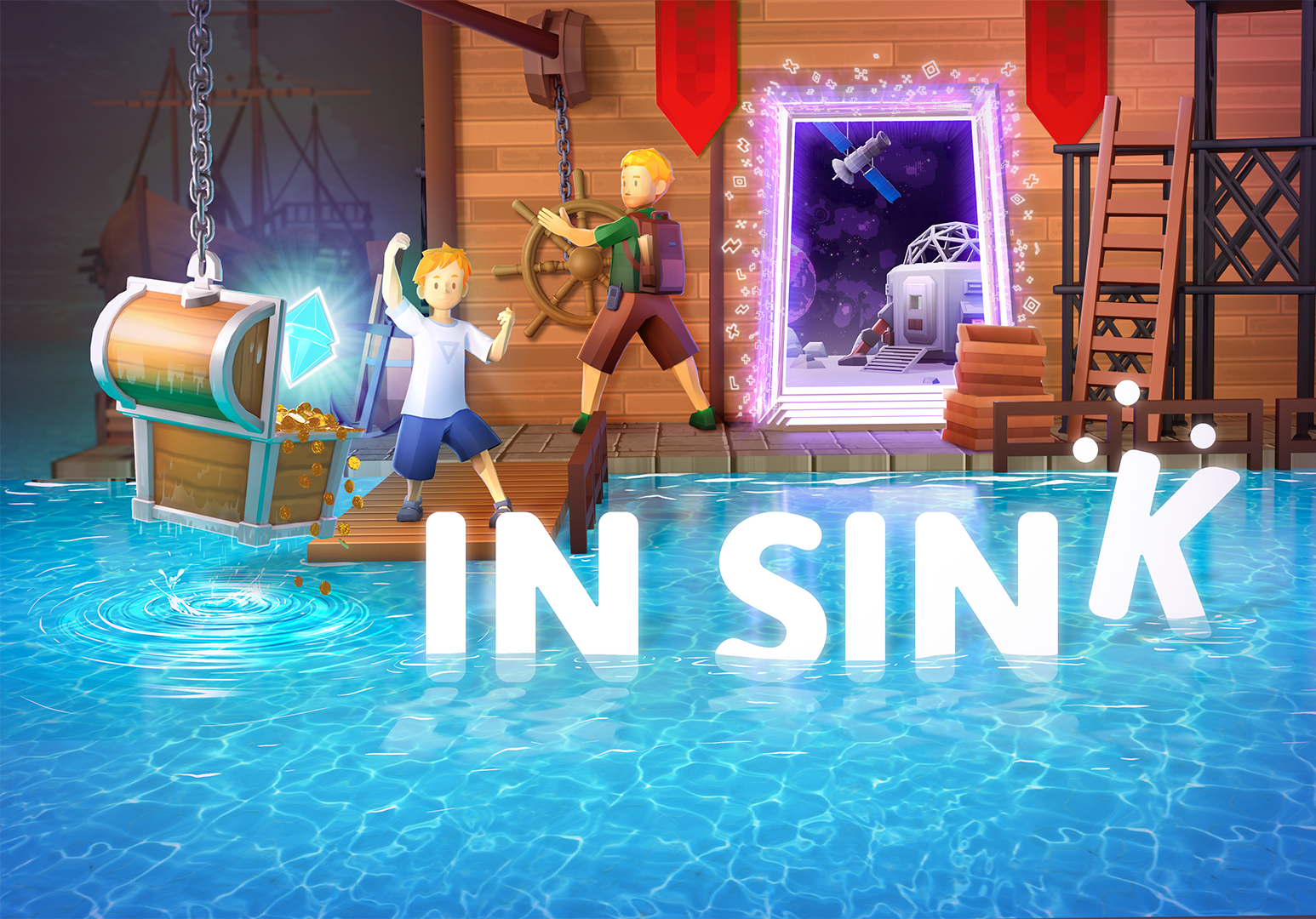
We’re excited to announce that we’ve synced up with UK-based publisher Kwalee!
[Add trailer here]
At the Future Games Show, we announced that we’ve partnered with Kwalee to release In Sink.
Being shipwrecked is just the beginning of your co-operative adventure in In Sink. On this strange island, you’ll jump through portals to puzzling places, each with its own quirks and unique theme. As you leap from place to place, you'll begin to unveil the island's mysteries. Together, you’ll need to think outside the box, and then escape from it.
Progress through puzzles with language-less elements like shapes, signs, colours, and numbers, all designed to be colour-blind friendly, making every world detailed in a different way. Turn wheels, flip levers, use scales, and press buttons and pressure plates to solve unique conundrums, testing your skills for escape.
Can you stay In Sink or will your plans go down the drain?
Check out our prologue and test your skills, patience, and teamwork.
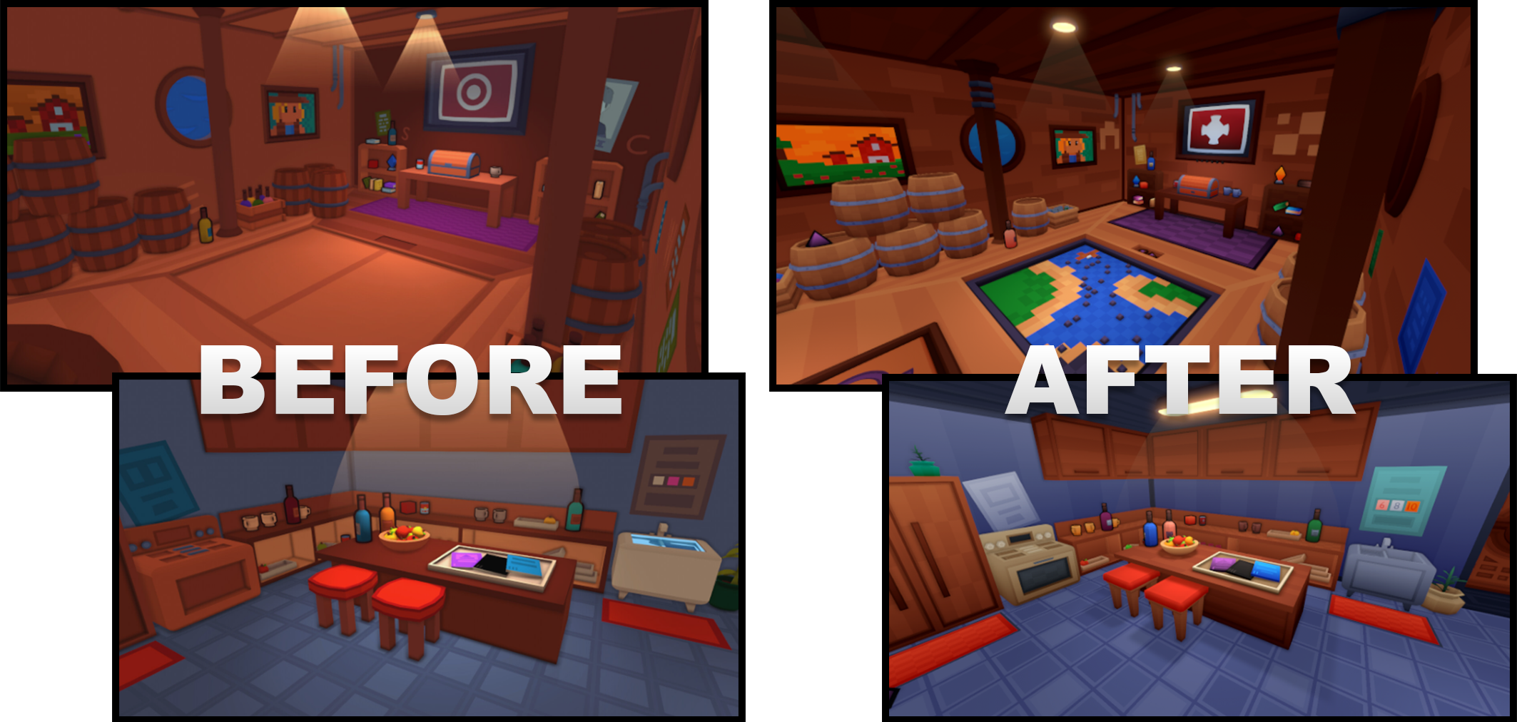
If you’ve played our prologue, you may have noticed that the lighting differs from the recent screenshots we’ve been sharing of the game. This is because everything in the prologue is ambiently lit at ~95% brightness and virtually no shadows are cast, so a lot of the in-world lights that you see are cosmetic, aside from a select few spotlights that shine down in some parts of the level.
In order to make the lighting look more natural, we decided to switch to a real-time lighting system!
As you can see in the comparison photo above, in the prologue it looks as though almost everything is lit by default and there are a few spots, such as the areas directly below the in-world lights, that are especially bright. With our new lighting system, everywhere is a lot darker by default and only the lit spots are bright. On top of that, there are more lit spots in each level, they’re brighter, they’re at a wider angle, and they have smoother falloffs, which adds to the realism of the lighting.
We also decided to incorporate the use of light cookies into multiple areas of our levels. This has allowed us to produce the illusion of high fidelity lighting without the associated performance cost, as shown in the image below.
For the final touch, there’s now a post-processing stack that adds bloom to the lights and tone-mapping, which gives the lighting a slightly warmer temperature and makes the levels look a lot cosier.
In short, the combination of the art refresh and the new lighting system have come together to create a style that we hope you’ll love even more than the prologue!
Tune in to our next developer diary, where we’ll be discussing how we’ve been making some significant changes to ensure In Sink is more accessible for colorblind players.
Want to meet other In Sink fans and challenge them to a speedrun in our prologue?
Then don’t forget to join our Discord!
Developer Diary #1 - Our Art Refresh
Welcome to our first developer diary!
In this instalment, we’re going to be showcasing how our latest art refresh has made a massive impact on both the game’s performance and design 🎨
We hope you all enjoy this behind-the-scenes look at how and why we changed our art style!
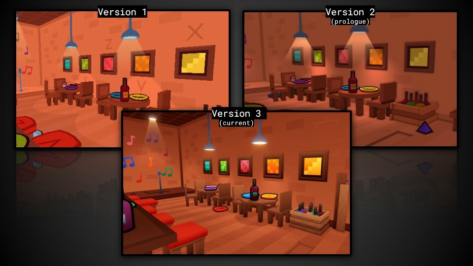
You may be surprised to hear that we originally planned for In Sink to be split, with half of the game being a third-person platformer and half of it being a first-person escape room-style experience! We had been inspired by games like A Short Hike and thought a pixelated art style would really suit the type of game we imagined In Sink to be.
When we first started working on levels, we would render the game at a downscaled resolution and then stretch it up to the native resolution to achieve this art style. This meant that we needed to use single flat colors on all of the textures, as any sort of gradient or variation would look bad or the detail would get lost when the resolution was scaled down. In short, we had to keep it simple.
After we released our first demo for In Sink, we realised that what made the game so unique and attractive to players was the escape room element, so we made the decision to remove the third-person platformer aspect of the game and focus entirely on making an enjoyable escape room experience. Although we still liked the pixelated art style, we felt it didn’t really make sense for an escape room style game, where detail and clarity were of paramount importance. This was particularly significant once we decided to go in a totally language-less direction for the game.
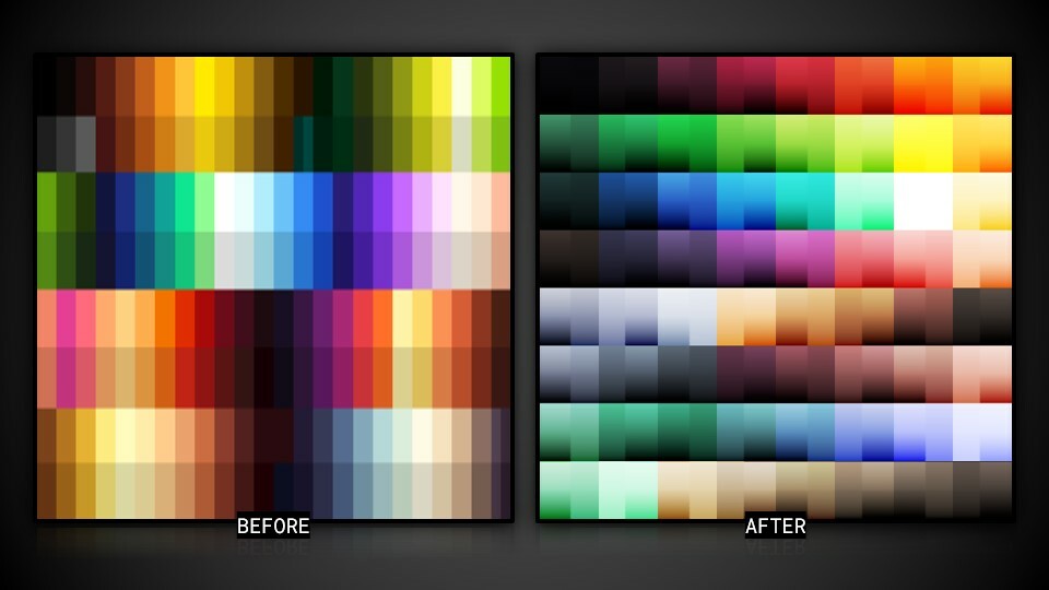
With that in mind, we changed the original color palette for the game.
In the image above, you can see a comparison between our original palette and our new palette. This change opened up a whole new world of color and made objects in the game look more natural. The new shading/normal texture maps meant that we could create dark/light spots even without the presence of light in the room, as shown in the image below.
On top of making the levels look more natural and producing a design that we liked, there was another major benefit to this new system.
With the old palette, each object only had a single flat color on any given face of its mesh. This meant that certain objects required more faces in order to have any kind of color variation. These color differences were also a lot less gradual and therefore more obvious, giving the objects the “blocky” appearance characteristic of traditional pixel art.
By moving away from the pixel art style and switching to the new color palette, we were no longer limited to flat colors. Each color had a full variation from bright to dark and object faces were no longer limited to just one flat shade, which allowed us to cut down on the number of faces we needed in order to create color variations and gradients.
With the old system, we would have to create multiple faces on any given mesh to produce the effect of a light/dark gradient on the object itself. With the new system, we only needed to create one face to produce the same effect and the added color variety meant the gradient looked a lot smoother.
In this way, we were able to significantly reduce the number of triangles for each model, which meant our art refresh also resulted in a significant optimization upgrade as well!
Overall these changes have combined to create an art style that we’re a lot happier with. With all of the developer talk out of the way, here’s a screenshot demonstrating just how big of an impact this new system has had on the appearance of In Sink.
That being said, this wasn’t the only change we made to complete our new look!
Tune in to our next developer diary, where we’ll be talking about the changes to our new lighting system.
Want to meet other In Sink fans and challenge them to a speedrun in our prologue?
Then don’t forget to join our Discord!
In Sink Demo Playthrough!
Join us to chat with the Dev's and watch a pre-recorded playthrough of the In Sink Demo. If you enjoy what you see, save yourself the spoilers and go try it out with a friend! Don't forget to wishlist to be notified when the full game launches.